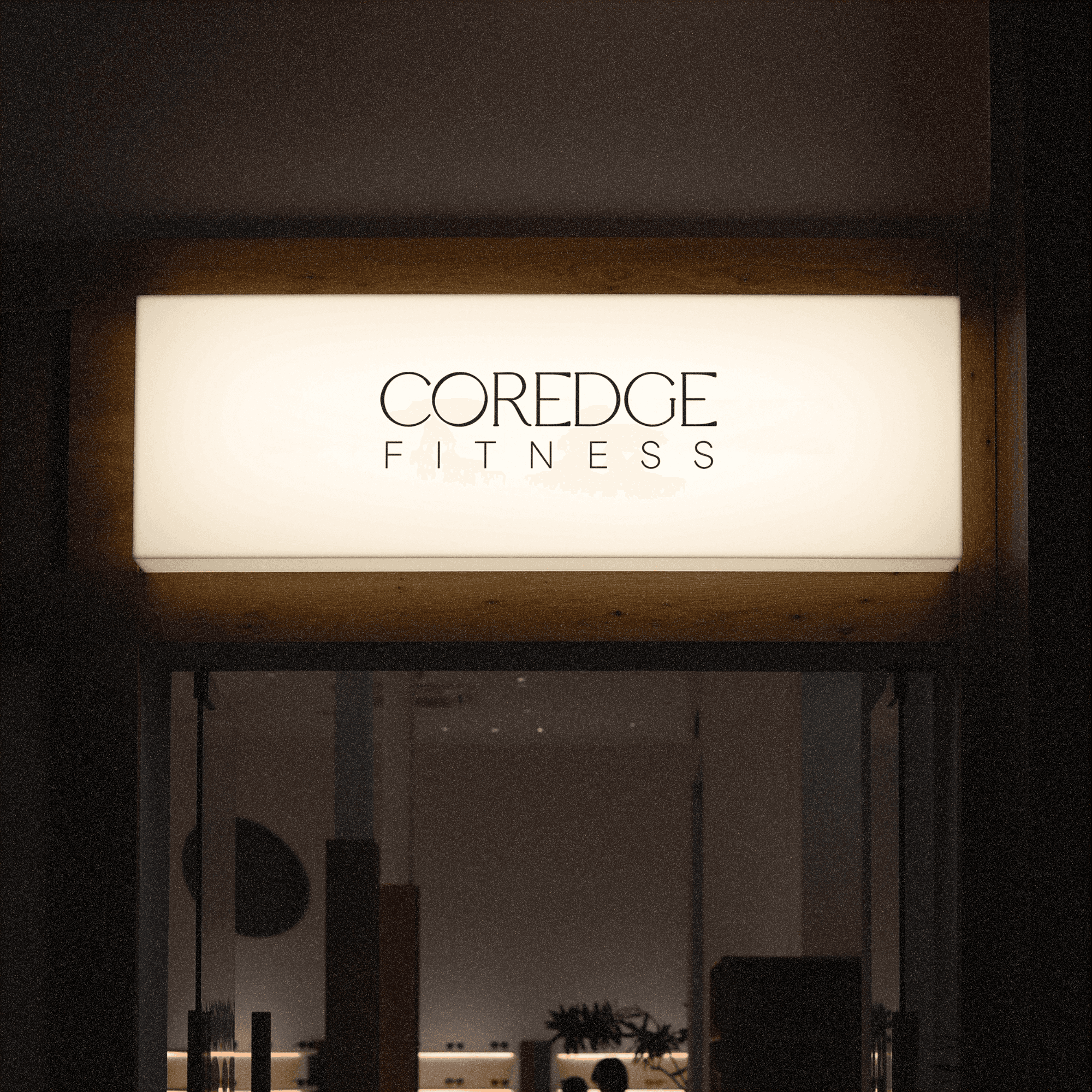
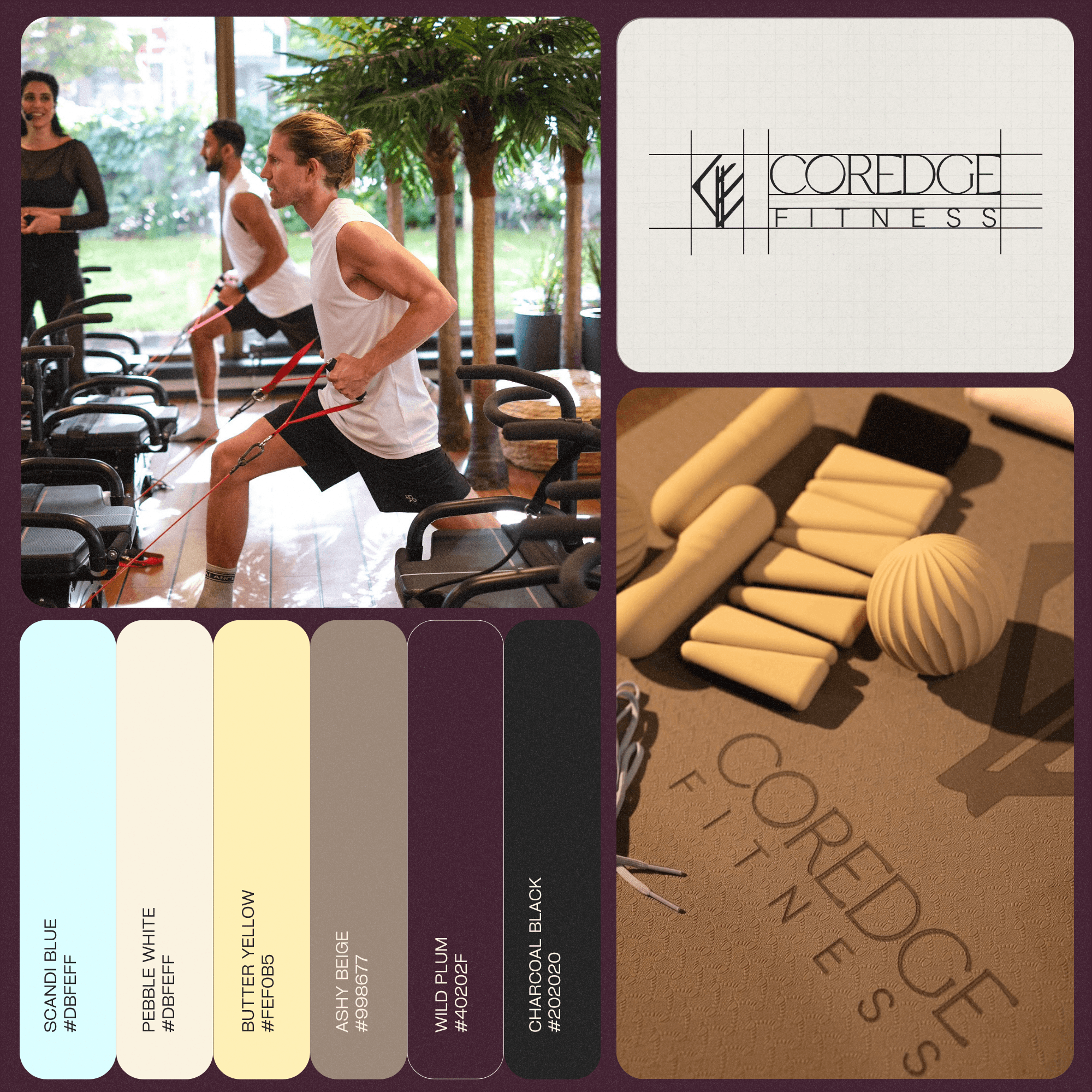
CorEdge Fitness was envisioned as more than just a fitness studio - it was designed as a lifestyle movement rooted in discipline, intentional living and mindful strength. Inspired by the founder’s Indian heritage and Norwegian upbringing, the brand identity draws heavily from Scandinavian design philosophy, Nordic history and the calm resilience embedded within that way of life.

The mission behind the identity was to create a visual language that felt refined yet powerful - balancing peace with intensity, softness with structure, and wellness with endurance.

Category:

Visual Identity

Client:

CorEdge Fitness

Duration:

2 months

Location:

Mumbai, India

banner
Pool
Man In The Gym
Woman
banner
Pool
Man In The Gym
Woman
banner
Pool
Man In The Gym
Woman
we are
(TDS__26)
a serious studio
we are
a serious studio
we are
a serious studio
© got questions?
(tds® — 01)
We'll answer them :)
© got questions?
We'll answer them :)
© got questions?
We'll answer them :)

FAQ.

FAQ.

FAQ.

We believe in clear communication.

For example, if we disagree on something, we'll give you a donut and hope you change your mind.

01

What services do you offer?

02

How long does a project take?

03

How many revisions do you provide?

04

Do you work with small businesses?

05

Do you require a deposit?

06

What’s your process like?

07

Why are you called The Donut Studio?

08

Can you make our logo bigger?

What services do you offer?

How long does a project take?

How many revisions do you provide?

Do you work with small businesses?

Do you require a deposit?

What’s your process like?

Why are you called The Donut Studio?

Can you make our logo bigger?